Introduction
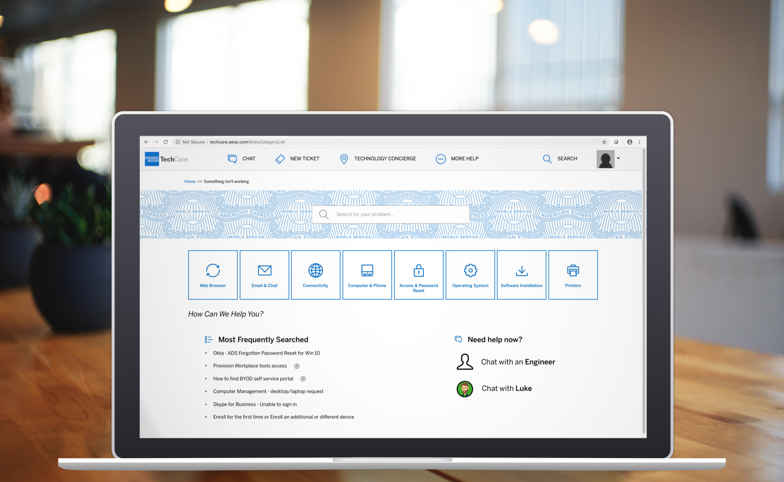
TechCare SIW Web Portal is an intranet IT support platform at American Express that contains technical support articles to all American Express employees. In addition to browsing SIW, employees can also seek help through contracted Service Desk Calls, or through Tech Concierge, a physical IT support office in each company location.
I spearhead the complete redesign process by uncovering stakeholder pain points through stakeholder interviews, unmoderated and moderated usability testings.
Timeline & Status
5 weeks & shipped as of 2020
my Role
Research, UX design, UI design,
Cross-team collaboration
Tools
Adobe Photoshop, Sketch, inhouse Survey tools
The Problem
Instead of using the current Tech Care Portal, Employees would rather wait in physical lines at Tech Concierge or call IT support for help. Many experience confusion navigating the web portal, or could not find the right IT solutions. The average user clicks into
10+ different pages before finding an answer to their problem among 220+ articles. This is the problem I am addressing, because its alternative solutions are very costly.
research
Identifying Stakeholders
I first chose to interview management team and owner to consolidate on product direction and appropriate UX strategies for this redesign. Because TechCare is the center piece that directs Amex employees to Tech Concierge, I first identified potential stakeholders to be the following.
Current Design
“The user experience is very flat. It requires users to know what exactly is wrong!”
Pain Point: Users Became Their Own IT Expert
Redesign Opportunities and Comparative Research
Examples of more client facing IT Support portals
I researched on common help center designs as I started ideating what the future SIW page looks like. This was important because SIW as a IT support center is employee facing, and contains very “dry” materials (aka technical support documents). I needed to:
reduce number of clicks to browse articles
reveal more helpful information to user correctly identify their IT issues
Ideation
Paper Sketches
Iteration Board
Testing
“Is Less More?” - Balancing Trade-Off
In my initial iterations, in an attempt to shorten the user journey, I combined the category navigation and article navigation together on one page. However, the large amount of information could distract users from unpacking the articles properly. To test this assumption, I recruited and tested with a small group of users.
“Too Many Options!” — Attention Hijacking
Through observation, I found that over 30% of my users jumped through different categories or articles excessively without reading the first articles they selected. Because of the amount of options available to them, some users were determined to “find the absolutely perfect solution”.
final Deliverable
A Guided Journey
I created a landing page per problem category with shortcuts to most frequently viewed links based on real click-through analytics.
New Iconography
hand-off & acknowledgements
Throughout this design process, I made sure my designs were implantable with the site’s admin capabilities and the supporting tech stack. After positive reviews from a cross-functional team, I handed off my final deliverables to development.
I reflected on the importance of leaving white space not just for best visual impact, but for an overall positive emotional experience in a stressful situation. To design for a high traffic internal tool requires a lot of planning, but most importantly, empathy for the users. Employees, although are not clients, still need a great supportive digital workplace to perform their daily tasks.


